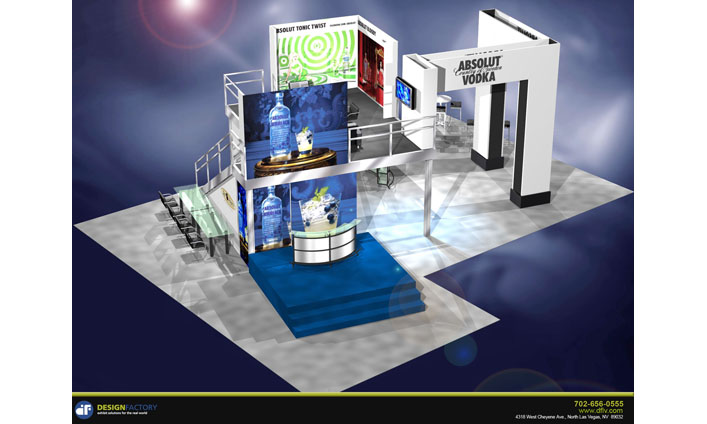
Trade Show Exhibits | Common Exhibit Design Mistakes
This post may contain affiliate links or Google Ads and we may earn a small commission when you click on the links at no additional cost to you. As an Amazon Affiliate, we earn from qualifying purchases. This is at no additional cost to you and helps with our website expenses.
The exhibit design of your trade show exhibits can help you improve your business reputation, generate more leads and sales, and make your booth and displays stand out in a crowd. If the right design factors are not chosen then you could end up with the opposite results instead.
You could also end up wasting or losing money rather than making it. There are a number of common mistakes that are frequently made that could affect the outcome that you see with your booth and displays. One of the top errors in this department is trying to go cheap and sacrificing quality results.
The graphics used with your trade show exhibits should be exceptional. If this is not the case then your display will not be as effective or attractive as it should be. Another mistake made is not taking advantage of custom design services and professional help when you are creating the exhibit that you want. The booth size you choose is a crucial factor and the exhibits that you include should leverage the technology that is easily available today.
Trying to go Cheap on the Exhibit Design Could Cost You
Everyone has a budget that they must stay in. But trying to go cheap with your trade show exhibits could end up costing you more in the long run. This is a rookie mistake that is sometimes made by experienced companies as well. If your design is poorly executed then your displays could look less than impressive.
Choosing a standard booth will not help your business stand out among many other offerings and this could cost you potential clients and sales as a result. You only get a few minutes at the most to make an excellent impression and a cheap exhibit will not do this.
Are your Graphics as Good as they Could Be?
The graphics that you use with your trade show exhibits are crucial. You need colors and images that grab the visitor and draw them in. Repetition is also important because it sets a pattern that is easy for attendees to follow. This helps to reinforce your authority and persuade potential clients.
Psychological studies have found that repeated patterns or images create a subconscious need for familiarity and a desire to associate with the brand responsible. Use bold colors, eye catching designs, and repeated patterns in order to attract visitors right away and help your services or products stand above the rest.
Get Professional Help and a Custom Design for your Trade Show Exhibits
A professional exhibit design that is customized for your products or services is often overlooked and this is a big mistake. The impact you will get when your booth and displays are custom created for your specific needs and offerings can be hard to beat.
If you pick out a standard display then you could find other companies that are also using the same design template or components. This will not help you get noticed, instead it will make your trade show exhibits blend into the background and will not generate the interest that you are hoping for.
Is your Booth Size Ideal?
The size of the booth you use is an important consideration with your trade show exhibits. You do not want your display to seem cramped or have a booth that is not easily accessible to your staff and visitors. The wrong both size could leave a poor first impression and cause visitors to walk by without stopping.
Do your Exhibits Leverage Technology?
Leveraging the technology available today can be a great way to grab attention but some trade show participants do not take this step. LCD monitors can be fairly inexpensive now, and the wide availability of the Internet is also a big plus. If you are not leveraging technology properly then your display will not pop and reach out to interested visitors.
What mistakes have you made with trade show exhibits in the past?


