Convention Printing | Tips to make your Flyers easier and more Effective
This post may contain affiliate links or Google Ads and we may earn a small commission when you click on the links at no additional cost to you. As an Amazon Affiliate, we earn from qualifying purchases. This is at no additional cost to you and helps with our website expenses.
Make sure your convention printing is the best it can be!
Convention printing is a top concern for companies who use these events to market their services and products. Flyer printing can be simple and straight to the point or it can be a complex process that often ends in disappointment. Poor graphic design or the wrong choice of templates can be very costly in terms of lost customers and revenue that is not received.
The colors and shading techniques are also a critical element of any fliers or other convention materials. The ink choices and the stock used can also make an impression or leave potential customers with a poor image of your business. When all of the right features and options are used you will get the materials that you want, and they should leave a lasting and favorable impression of your company from all the convention and trade show attendees.
Graphic Design is Critical with Convention Printing
One of the most important aspects of convention printing is the graphic artwork and design. The visual components of your fliers should stand out well, and the entire design should be striking yet easy to follow for potential clients. These materials may be the first indication a consumer has that you can offer them needed products or services, and a favorable design will improve the follow through rate.
A professional graphic designer is usually a good idea for your flyer printing. These specialists can help you determine where the visual images are placed, and how to put the text so that it is noticed and effective. They will also give advice on the overall effect that the materials will have, and they can help make changes that make your printed matter stand out above the rest.
The Right Flyer Printing Template does make a Difference
Printing companies may offer various templates for customers to use, and they typically range from small to large. The best tip is to start with a template that is in the middle size wise. The largest sizes may not be cost effective, and the additional costs may not be offset by an increase in marketing activity and consumer follow through.
If you start off small then your potential customers may not be impressed, or they may consider that your company places a top priority on cost rather than quality. A medium sized template is small enough to be handled easily, yet large enough to get your message across very effectively.
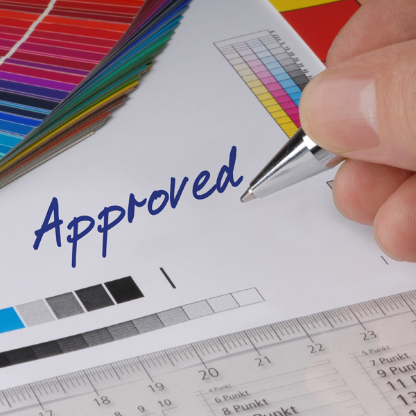
Full Color is the Best way to Go
A common mistake many make in flyer and convention printing is to use only black and white or minimal color options in order to cut back on cost. A full color product is more visually appealing, and will get noticed much faster than one that only uses black and white. The shading of the colors is also a consideration. Placing black ink on color paper is not enough to get the results you want.
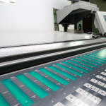
Glossy Inks and Durable Stocks are Essential
The inks and stocks used for your convention printing needs should be one of the most important decisions that you make. Thickness will determine how durable the fliers are, and coated paper will stand up better to normal handling and elemental damage. Glossy inks add sparkle and an eye catching element that can really grab attention. They may offer more color dimensions and depth, and a shine that is very attractive.
Do you have any convention printing tips that others may find useful? Let us know in the comment section below?